Why These Tools Matter
Picking colours by hand? That’s a recipe for clashing tones and wasted hours. Adobe Color and Coolors aren’t just conveniences — they’re shortcuts to palettes that actually work together. You’re not relying on gut instinct anymore. You’re using colour theory.
Whether you’re designing a website for a Hong Kong startup or refreshing a local brand identity, these tools save you time while keeping cultural sensitivities in mind. You’ll generate dozens of palettes in the time it’d take to manually tweak a single one. The real advantage? You can test variations against WCAG contrast requirements instantly.
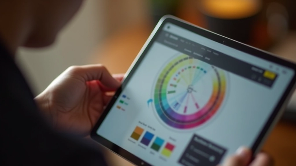
Getting Started with Adobe Color
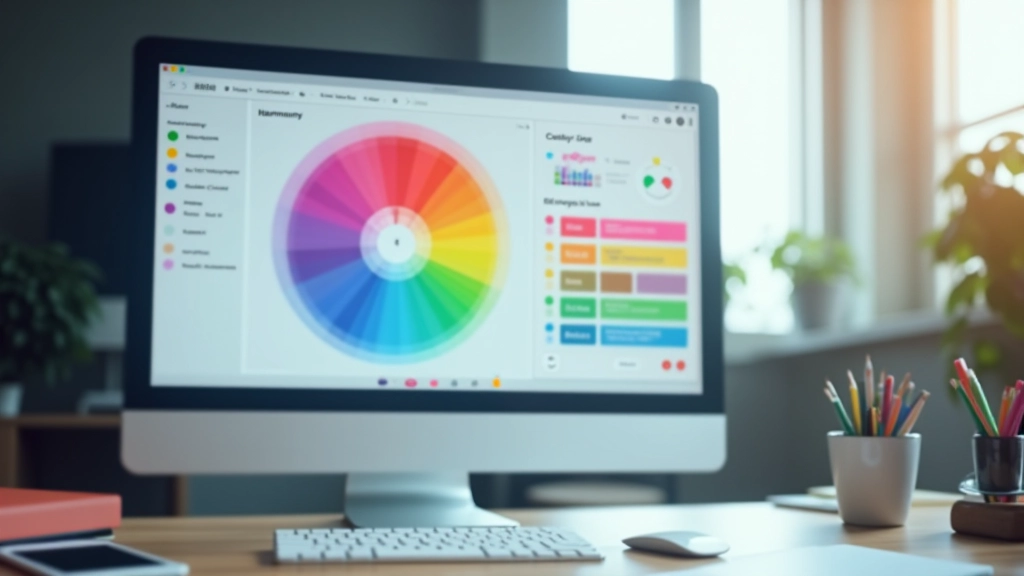
Adobe Color (formerly Kuler) is built right into the Creative Cloud ecosystem. It’s free to use even without a subscription, and you’ll find it at color.adobe.com. The interface isn’t intimidating — you’re looking at a colour wheel with five selectable points.
Start by selecting a harmony rule. That’s the foundation. You’ve got Complementary (opposite colours), Analogous (neighbours on the wheel), Triadic (three equally spaced), Tetradic (four points), and Shades. Don’t just pick one randomly. Think about your project. If you’re building a site that needs visual energy and contrast, Complementary is your friend. If you want sophistication and flow, Analogous is calmer.
The colour wheel itself lets you drag any point around. You’re not locked into the automatic suggestions. That’s where it gets powerful — you can respect the mathematical relationships while fine-tuning for your specific needs. Say you want that Complementary pair but you need one shade slightly darker for WCAG contrast? Drag it down.
Educational Note: This guide covers tool features as of April 2026. Both Adobe Color and Coolors evolve regularly. We recommend checking their current interfaces for any updates to workflows or available harmony rules. These tools are meant to accelerate your design process, not replace your understanding of colour theory fundamentals.
Coolors: Speed and Simplicity
Coolors takes a different approach. It’s deliberately minimal. You land on coolors.co and you’re immediately looking at a palette — five random colours. Press the spacebar and you get a new palette. That’s it. That’s the core interaction.
But here’s what makes it brilliant for rapid exploration: you can lock individual colours while generating new ones. Say you’ve got a brand red that’s non-negotiable. Lock it. Hit spacebar. Now you’re finding complementary palettes around that fixed colour. Within 30 seconds you’ve tested 20 variations. Adobe Color’s deliberate fine-tuning can feel slow by comparison.
The keyboard shortcuts make this even faster. Spacebar generates new palettes. Arrow keys adjust individual colours. You’re not clicking menus — you’re dancing across the keyboard. For Hong Kong designers working with cultural colour associations, this speed is crucial. You can quickly explore how red (luck and fortune) pairs with gold (wealth) across different saturation and brightness levels.
Exporting and Testing for WCAG
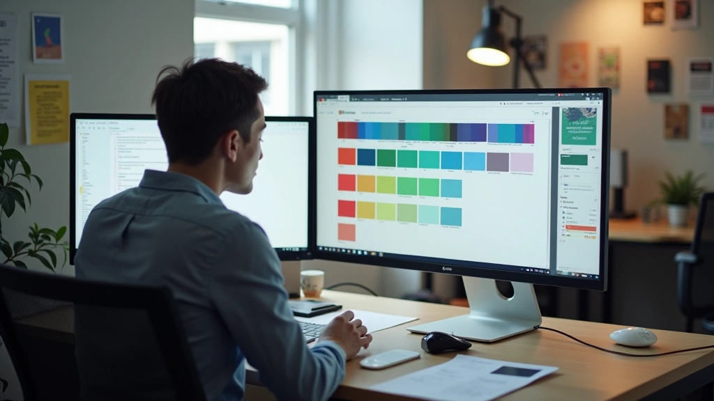
Both tools let you export palettes in multiple formats. You’ll want CSS variables, hex codes, and RGB values depending on your workflow. Adobe Color exports directly to files. Coolors gives you a shareable URL and download options. Neither feels clunky.
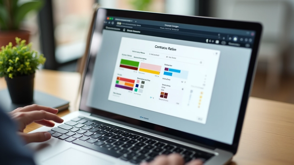
Here’s the critical step many designers skip: testing contrast. A palette might look beautiful on your monitor and completely fail WCAG AA standards (4.5:1 contrast minimum for body text). You’ve generated a palette that’s harmonious but potentially inaccessible.
Use a contrast checker tool alongside these generators. WebAIM’s contrast checker is free and reliable. Pair your background colour with your proposed text colour. If it fails, adjust. Maybe your dark navy background needs lighter text. Maybe your accent colour needs to be more saturated to meet the ratio. This isn’t complicated — it’s just a step that takes five minutes and prevents major accessibility issues.
Practical Workflow for Hong Kong Projects
Here’s a concrete process that works. Start in Coolors. Generate 10-15 palettes rapidly, locking your culturally significant colours (if you’re using red, lock it). Find three palettes you like. Screenshot them. Then move to Adobe Color. Input one of your favourite palettes as the base. Use the harmony rules to understand the mathematical relationships. Can you make it more sophisticated? Adjust the saturation of one colour. Does it still work?
You’re not bouncing between tools randomly. You’re using Coolors’ speed to explore, then Adobe Color’s precision to refine. This takes maybe 20 minutes for a solid five-colour palette. Without these tools? You’d be manually testing combinations all morning.
Export your final palette as CSS variables. Test every colour combination that’ll appear in your design against WCAG requirements. You’ll catch contrast failures now, not during user testing. Your Hong Kong clients will appreciate that you’ve respected both their cultural colour expectations and accessibility standards.
The Real Takeaway
Adobe Color and Coolors aren’t magic. They won’t make bad colour choices good. But they’ll save you hours of trial-and-error. They’ll let you explore variations faster than you could manually. They’ll help you understand why certain colour combinations work mathematically.
More importantly for Hong Kong projects specifically, they let you respect colour theory while staying culturally sensitive. You can lock that culturally significant colour and build around it. You can test whether your palette meets accessibility standards before it goes to development. You’re designing smarter, not just faster.
Start with Coolors for speed. Move to Adobe Color for understanding. Always test against WCAG. That’s the workflow that works.