
Understanding Colour Harmony Basics
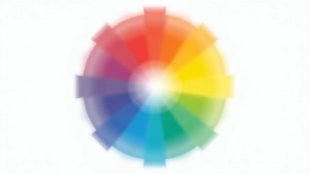
Colour harmony isn’t magic—it’s science. When colours sit next to each other on the colour wheel, your brain recognizes patterns. These patterns feel either calming or energetic, balanced or dynamic. That’s where complementary and triadic schemes come in.
Think of the colour wheel as a clock. Complementary colours sit directly opposite each other—think orange and blue, red and green. They’re as different as two colours can be, yet they create stunning visual impact when paired together. A designer using complementary colours deliberately creates contrast and draws attention.
Triadic schemes, on the other hand, use three colours equally spaced around the wheel—like 12 o’clock, 4 o’clock, and 8 o’clock. They’re more complex than complementary pairs but offer richer possibilities. You’re not stuck with just two colours; you’ve got flexibility and depth.
Important Note
This guide provides educational information about colour theory principles. While these rules work across most design contexts, cultural meanings of colours vary significantly. In Hong Kong and East Asian markets, colour associations differ from Western conventions—red means luck and celebration, white can signify mourning in some contexts, and gold represents wealth. Always research your specific audience before finalizing a palette. Colour harmony is foundational knowledge; cultural context is essential application knowledge.
Complementary Schemes: Bold Visual Tension

Complementary colour schemes deliver immediate visual pop. You’re essentially using opposite colours—ones that make each other appear more vibrant. A navy blue background with a bright orange call-to-action button? That button’ll jump off the screen.
Here’s where complementary schemes shine: they’re perfect for grabbing attention. If you need users to notice a specific element—a “Buy Now” button, a warning message, a featured offer—complementary colours are your tool. They don’t blend in. They demand attention.
But they’re intense. Complementary schemes work best when one colour dominates and the other acts as an accent. You wouldn’t want equal amounts of orange and blue throughout a design—your eyes would get tired. Instead, use blue as your primary background, then deploy orange sparingly for key interactive elements.
Triadic Schemes: Balanced Energy and Flexibility
Triadic colour schemes offer something complementary pairs can’t: balance across three distinct hues. You’re working with equal visual weight spread across three points on the colour wheel. That means more creative flexibility and visual interest without the intensity of direct opposition.
A triadic palette might use deep teal, warm coral, and mustard yellow. Each colour brings something different to the table. Teal feels calm and professional. Coral adds warmth and energy. Mustard provides earthy sophistication. Together, they create harmony without monotony.
The real advantage? You’ve got three colours to play with. One becomes your primary, one your secondary, and one your accent. This gives you more breathing room than complementary schemes. You’re not forced into a stark two-colour decision. Triadic schemes feel more sophisticated and nuanced.
They’re also less fatiguing to look at for extended periods. Because you’re not using pure opposites, there’s less visual vibration. Your eyes can rest while still experiencing visual interest.

Practical Application: Building Your Own Schemes
Theory’s useful, but application is where things get real. Let’s walk through how you’d actually build these schemes from scratch.
For Complementary Schemes
- Start with your primary colour—the one that defines your brand.
- Find its direct opposite on the colour wheel. Online tools like Adobe Color make this instant.
- Decide which colour dominates. Typically, the secondary colour takes up 20-30% of your design space.
- Test contrast ratios. Complementary colours don’t automatically mean readable text—check your WCAG ratios.
For Triadic Schemes
- Pick your starting colour. This becomes your anchor.
- Rotate 120 degrees clockwise. That’s your second colour.
- Rotate another 120 degrees. That’s your third.
- Assign roles: primary (50%), secondary (35%), accent (15%). These proportions keep balance.

Real example: You’re designing a fintech app for Hong Kong users. You choose deep navy as your primary—it signals trust and professionalism. For a complementary scheme, you’d pair it with warm coral for action buttons and alerts. The coral grabs attention without screaming at users.
Alternatively, with triadic, you might use navy, coral, and a sophisticated sage green. Navy handles the interface foundation. Coral highlights critical actions. Sage green softens the overall feel and appears in secondary UI elements. Users see variety without chaos.
Accessibility and Contrast: The Non-Negotiable Part
Here’s what beginners often miss: harmony doesn’t guarantee readability. Two colours can be perfectly complementary on the wheel but create unreadable text if contrast is weak. That’s why WCAG accessibility standards exist.
Your text needs a 4.5:1 contrast ratio minimum for regular text, 3:1 for large text (18pt or larger). Some complementary pairs naturally achieve this. Orange on dark navy? Usually fine. Light blue on light grey? That’s a failure waiting to happen.
Test everything before deploying. Use WebAIM’s contrast checker or similar tools. Input your foreground and background colours, and it’ll tell you instantly if you’re compliant. It takes 30 seconds and prevents accessibility failures affecting millions of users with vision impairments.