Why Colour Context Matters in Hong Kong Design
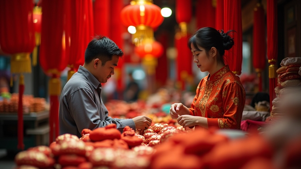
You’ve probably seen red lanterns hanging outside shops during Chinese New Year. There’s a reason for that — it’s not random decoration. Every colour carries cultural weight in East Asian contexts, and when you’re designing for Hong Kong audiences, getting this right isn’t just nice to have. It’s essential.
The difference between a design that resonates and one that feels off-key often comes down to colour choices informed by cultural understanding. A colour that signals prosperity in one context might mean something entirely different in another. We’re going to walk through the key associations, how they show up in real Hong Kong design, and practical ways to implement them while maintaining accessibility and visual harmony.
Cultural Context Varies
Red: The Colour of Fortune and Prosperity
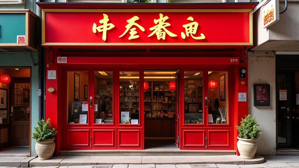
Red dominates East Asian design for one clear reason — it symbolizes luck, happiness, and prosperity. In Hong Kong specifically, you’ll see red everywhere during celebrations: on shop signs, packaging, and especially during lunar new year festivities. It’s not decoration. It’s intentional cultural signalling.
For digital design, red works powerfully as an accent colour. Use it for call-to-action buttons on financial services websites, e-commerce checkout prompts, or important announcements. The cultural weight gives it extra impact. A Hong Kong user seeing red on a banking app doesn’t just register “urgent” — they also register positive energy and trustworthiness within that cultural framework.
Pair red (#E31C23 or #D32F2F) with white or gold for maximum impact. Avoid pairing red with black or dark colours unless you’re going for deliberate contrast. Most successful Hong Kong retail sites use red + white or red + gold combinations because they’re culturally recognized and visually balanced.

White: The Tricky Colour You Need to Handle Carefully
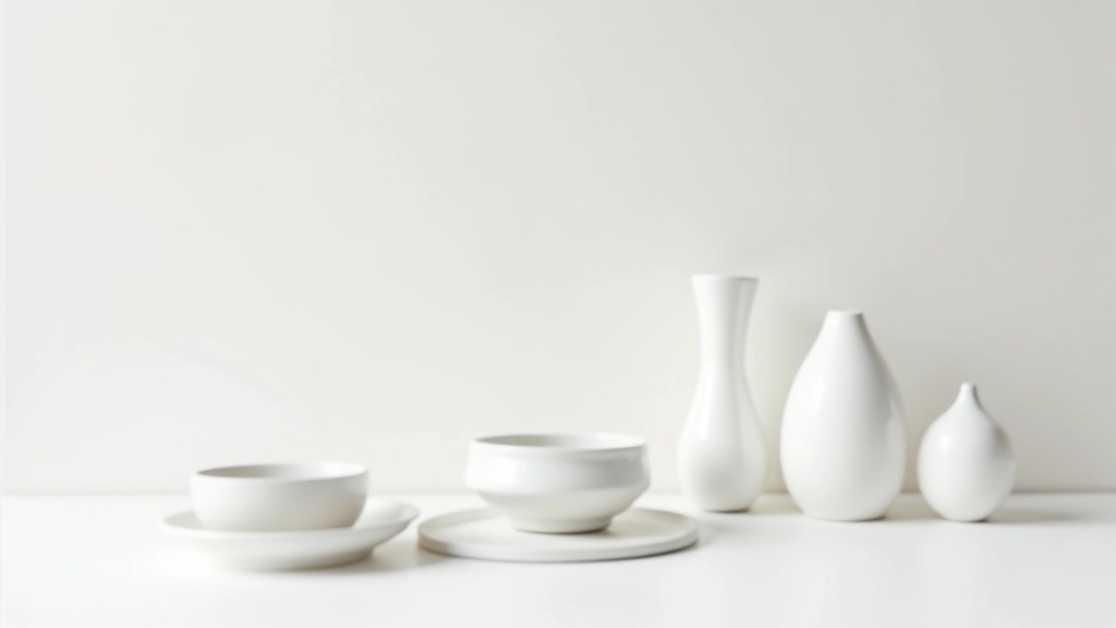
Here’s where many Western designers trip up. White isn’t neutral in East Asian contexts. It historically signifies mourning and is associated with funerals and death. You won’t see white wedding dresses at traditional Chinese weddings. You won’t see white as a primary colour on festive packaging. And you definitely don’t want white as your main colour choice on a site targeting Hong Kong users without understanding the implications.
That said, white works fine as a background or accent colour — it’s the cultural weight that matters. Use white for spacious, clean layouts and plenty of white space (that’s genuinely good design anyway). But don’t feature white as a primary brand colour unless you have specific reasons and you’ve validated this with your Hong Kong audience. For e-commerce sites, white backgrounds are standard and expected. For branding? Think twice.
Safe approach: White backgrounds for content, white cards for information architecture, but pair it with warm accent colours (red, gold, orange) to create positive emotional associations.
Gold: Wealth, Prosperity, and Premium Positioning
Gold represents wealth, prosperity, and good fortune. It’s used in luxury branding across Hong Kong because it works on both cultural and visual levels. The colour itself feels premium, and the cultural meaning reinforces that premium positioning. High-end watch brands, luxury car dealerships, financial institutions — they all lean on gold for these reasons.
In web design, you can use gold as a trim colour, accent, or highlight. It’s particularly effective for premium membership tiers, luxury product categories, or wealth management services. A Hong Kong user seeing gold on a financial dashboard doesn’t just see “this is important” — they see “this represents value and prosperity.” The psychological impact is stronger because the cultural meaning is already embedded.
Gold application strategies:
- Accent borders on premium product cards
- Background colour for “Featured” or “Best Seller” labels
- Icon colours for high-value features
- Text colour for pricing displays on luxury items

Practical Application: Building a Hong Kong-Aware Palette
So you understand the meanings. How do you actually build a working colour palette that respects these associations while maintaining modern design principles and accessibility standards?
Start with a dominant colour that aligns with your brand purpose. If you’re designing for e-commerce, red or gold might be primary. If you’re designing for healthcare or professional services, you’ve got more flexibility, but still consider adding warm accent colours. Build your secondary and neutral palette around your primary choice. Add white (which works as neutral background), greys for supporting content, and ensure all text meets WCAG AA contrast ratios (4.5:1 minimum for body text).
Test your palette with actual Hong Kong users before launch. What feels right to you might read differently to someone with deep cultural context. A 10-minute user interview with 3-4 people from your target audience can reveal colour associations you’d otherwise miss. You’re not changing your entire palette based on feedback — you’re validating that your choices don’t trigger unintended cultural responses.


Colour Meaning + Accessibility = Thoughtful Design
Cultural meaning matters, but accessibility can’t be an afterthought. You need both. A colour that’s culturally perfect but fails contrast requirements doesn’t work. A colour that’s accessible but culturally tone-deaf also doesn’t work.
This is why testing matters. Run your red, gold, and white combinations through contrast checkers. Ensure that red text on white background hits 4.5:1 contrast minimum (it usually does — red is dark enough). Make sure gold text is either paired with darker backgrounds or used as accent only (gold text on white fails accessibility). And remember that roughly 8% of Hong Kong’s male population has some form of colour blindness. Test how your palette reads in greyscale mode. A well-designed Hong Kong palette should work in colour and in greyscale.