Why Contrast Matters
Here’s the thing: accessibility isn’t some nice-to-have feature you add at the end. It’s foundational. When you ignore contrast, you’re excluding millions of people — not just those with colour blindness, but also anyone reading on a bright phone screen in sunlight, or someone with low vision.
The Web Content Accessibility Guidelines (WCAG) set specific contrast requirements. For regular body text, you need a 4.5:1 ratio between text and background. That’s a measurable standard, not a suggestion. We’ve tested countless sites, and you’d be surprised how many fail this basic check.
The WCAG Levels
- AA level: 4.5:1 for normal text, 3:1 for large text (18pt+)
- AAA level: 7:1 for normal text, 4.5:1 for large text
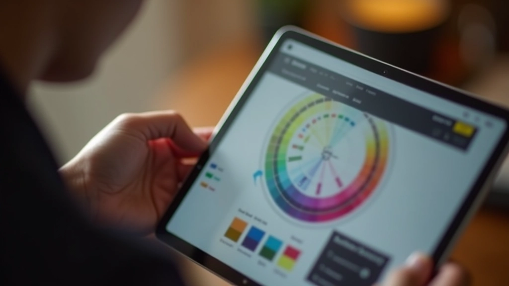
Testing Your Palettes
You don’t need expensive software to test contrast ratios. Free tools do the job perfectly. WebAIM’s contrast checker is straightforward — paste your hex values, get your ratio instantly. No account needed, no signing up.
What we see most often: designers pick colours they love, then find out halfway through development that the contrast fails. Then it’s a scramble to adjust. Test early. Test often. It takes maybe 30 seconds per colour combination.
Pro tip: don’t just test your primary text on the background. Test secondary text, links, buttons, hover states. Each element needs its own contrast check because they might sit on different backgrounds.
Important Note on Accessibility
This article provides educational information about WCAG contrast guidelines. Actual accessibility compliance depends on your specific project, audience, and legal requirements. We recommend consulting the full WCAG 2.1 standards and potentially working with accessibility specialists for critical projects. Different regions and industries have different mandatory accessibility requirements.
Common Failures & Fixes
Grey text on white? That’s probably failing. We see it everywhere and it’s always a problem. Light greys are beautiful in design mockups, but they’re invisible to many readers. If you love that softer aesthetic, use opacity on black text instead — it looks the same but maintains contrast.
Coloured text is another trouble spot. That nice teal link on a light background might fail. Gold text on cream? Definitely failing. Don’t rely on colour alone to communicate information — always pair it with another indicator like weight or underlining.
Background images behind text? Test that too. If your text sits on a photo, check the contrast at the actual placement, not just on solid colour. Sometimes you’ll need a semi-transparent overlay or text shadow to make it work.
Building Inclusive Palettes from the Start
The smartest approach is to design with contrast in mind from day one. Pick your primary text colour first. Dark charcoal or pure black for body text — you can’t go wrong. Then choose your background to ensure you hit that 4.5:1 ratio.
Accent colours need testing too. That vibrant brand red might work perfectly on white, but what about on your secondary background colour? Test every combination. It’s tedious, but it prevents problems later.
Here’s what we recommend: create a contrast matrix. List all your text colours and all your background colours. Test each pair. Document the ratios. Share it with your team. This becomes your colour usage guide — it answers “can I use this text colour on that background?” instantly.
Quick Contrast Check Workflow
- Extract hex values from your palette
- Use WebAIM or similar tool for each combination
- Record results in a spreadsheet or table
- Mark which combinations meet AA and AAA
- Update your design system documentation
Tools That Actually Help
WebAIM’s contrast checker is free and reliable. You paste your colours, it tells you the ratio and whether you pass AA or AAA. That’s it. No complexity.
For Figma users, there’s a built-in accessibility checker. Design in Figma, hit the accessibility button, and it flags contrast problems right there. It won’t replace manual testing, but it’s a great first pass.
Browser extensions exist too. If you’re reviewing a live site and want to check contrast on the fly, tools like WAVE or Axe DevTools show you contrast ratios for every element. Developers love these because they work during development, not just at the end.
The Real Impact
You might think “well, only a small percentage of people need this.” You’d be wrong. About 8% of men have some form of colour blindness. Add in people over 55 with age-related vision changes, people with cataracts, people reading on glare-heavy screens, and suddenly you’re talking about a significant portion of your audience.
Beyond the numbers, there’s the principle. You’re building for people, not for a theoretical perfect user. When you meet contrast standards, everyone benefits. That 80-year-old with presbyopia? She can read it. The person in bright sunlight? They can read it. The designer with red-green colour blindness? They can read it.
Accessible design isn’t a compromise on aesthetics — it’s a commitment to inclusivity. The best designs work for everyone.
Start testing today. It’s free, it’s fast, and it makes your designs better for everyone. No excuses needed.